Create Engaging CTAs: Why You Should Rethink ‘Click Here’
Understanding Click Here: A Call to Action Review
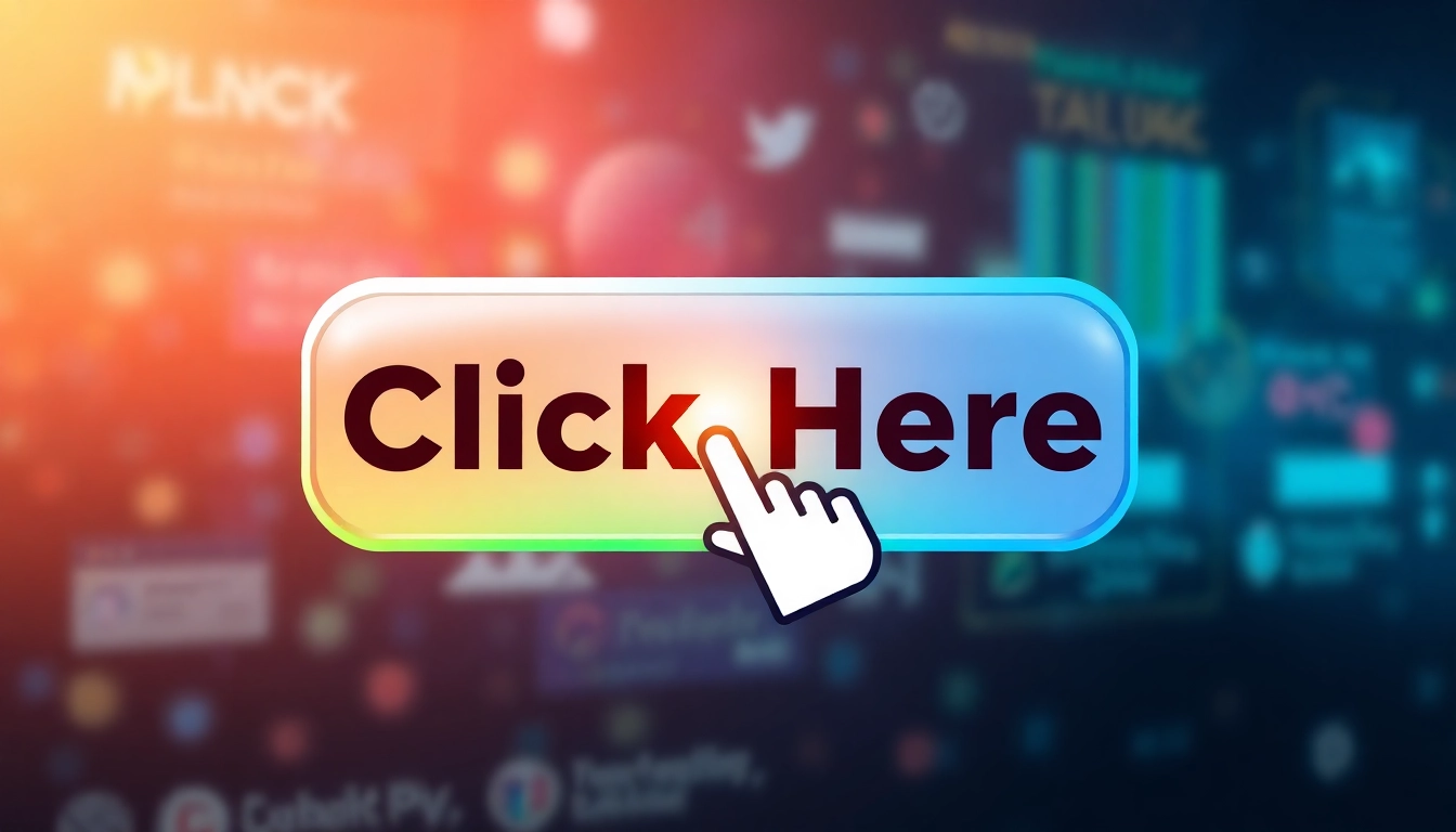
In the age of digital communication, the phrase “click here” has emerged as a ubiquitous call to action (CTA), seen on countless websites and in various emails. However, this seemingly straightforward instruction raises questions regarding its effectiveness and implications for user experience and search engine optimization (SEO). To explore this topic fully, we need to delve into its meaning, evolution, and particularly its role as a CTA. As a point of reference, if you wish to learn more about leveraging CTAs effectively, you can Click Here.
What Does Click Here Mean?
At its core, “click here” serves as a directive for users, signaling where they should interact on a webpage. It typically precedes hyperlinked text and is designed to prompt action. However, as the web matures, the clarity and specificity of these directives have come under scrutiny. Users are increasingly expecting that link texts articulate the purpose of the link rather than relying on generic phrases.
The Evolution of Web Language
The use of “click here” has its roots in the early internet days when user interfaces were less refined and intuitive. As web design has progressed, so has the language that supports it. The transition from “click here” to more descriptive phrases, such as “download our ebook” or “sign up for our newsletter,” illustrates a trend toward improved user experience and clarity in digital communication.
Why Users Click: Psychology Behind CTAs
Understanding the psychology behind user interaction is essential for crafting effective CTAs. Motivations for clicking can range from curiosity to urgency. Leveraging cognitive triggers, such as scarcity (e.g., “limited offer”) or social proof (e.g., “join 10,000 subscribers”), can enhance the likelihood of user engagement. Effective CTAs resonate emotionally with users, drawing them in through well-chosen words that align with their needs and desires.
Common Missteps with Click Here
The Risks of Uninformative Links
One of the primary criticisms of “click here” is its lack of informativeness. When link texts fail to convey destination or content, users may hesitate to engage. Informative links build anticipation regarding what happens next, thereby enhancing usability. Missteps in this area can mean losing potential engagement or interest from users.
Accessibility Issues: Screen Reader Implications
The phrase “click here” presents significant challenges for users relying on screen readers. Such tools summarize links for users, and vague link texts can lead to confusion and frustration. Accessibility best practices dictate that links should be understandable out of context, which reinforces the need to avoid vague terms. A better alternative might be to use descriptive link texts, enhancing navigability for all users.
SEO Impact: How Click Here Affects Rankings
From an SEO perspective, search engines prioritize relevancy in link texts. Using “click here” does not provide search engines with valuable context about the linked content, negatively impacting the overall SEO performance of a page. It is crucial to optimize anchor text to reflect the content destination accurately, thus enhancing both user engagement and search ranking potential.
Best Practices for Effective Calls to Action
Creating Contextual Links
Contextual links give users additional information regarding the action they are about to take. For example, rather than directing to “click here,” consider rephrasing to “download our free guide on healthy eating” — this ensures that context is provided upfront, enhancing click-through rates and overall user satisfaction.
Using Action-Oriented Language
Strong CTAs employ action-oriented language that encourages users to take the next step. Words like “discover,” “join,” or “explore” add dynamism to the invitation, creating a more engaging experience. The use of first-person language (e.g., “Start my free trial”) also establishes a personal connection with the user.
Examples of Better Alternatives
Instead of the generic “click here,” which provides little contextual value, try incorporating specific actions that describe what the user will receive or experience. Examples include:
- “Subscribe to our newsletter for the latest updates.”
- “Download your free 30-day meal plan.”
- “Get your exclusive discount by signing up today.”
Designing Visual CTAs
Color Psychology in Clickable Elements
Color plays a critical role in how users perceive a CTA. Different colors evoke different emotions — for instance, red denotes urgency and is often used for sales, while blue signifies trust and reliability. Choosing the right color for your buttons or links can lead to increased user engagement. Brands should consider testing various colors to see which engage users more effectively.
Size and Placement: Making it Eye-Catching
The size and placement of your CTAs can significantly impact their performance. CTAs should be prominent but not overwhelming. Additionally, placing them above the fold, where users can see them without scrolling, can lead to higher engagement rates. A/B testing different placements and sizes can provide data on optimal configurations.
Mobile Optimization: Touch vs. Click
As the majority of users now access websites via mobile devices, optimizing CTAs for touch interactions is paramount. This includes ensuring that buttons are large enough to be tapped easily and that the surrounding area is free of distractions. Responsive design should create a seamless experience across devices, catering to varying user behaviors and expectations.
Analyzing Performance Metrics of CTAs
Tracking Click-Through Rates
Measuring the effectiveness of CTAs involves tracking click-through rates (CTR), which provides insights into how users are interacting with your links and buttons. Tools such as Google Analytics can track these metrics and help identify which CTAs are performing well and which may need revision.
Utilizing A/B Testing for Optimization
A/B testing allows businesses to compare two versions of a webpage or an element (like a CTA) against each other to determine which performs better. This data-driven approach enables marketers to tweak the language, design, or placement of their CTAs, leading to improved engagement rates and conversions.
Iterating for Better Results: Feedback Loops
Gathering feedback is crucial for ongoing optimization. This can include user surveys asking for thoughts on the clarity and effectiveness of CTAs or utilizing analytics to see where users are dropping off. Continuous learning from this data allows businesses to refine their strategies over time and improve call-to-action performance.